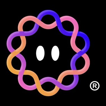

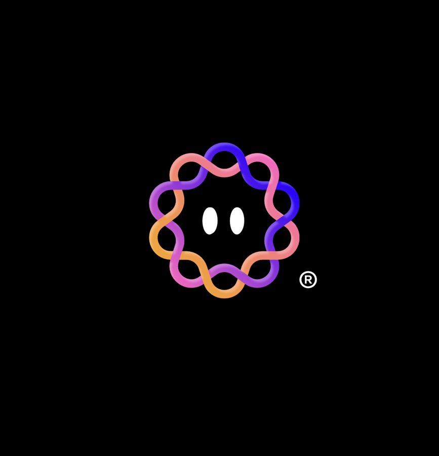

A mark with a face.
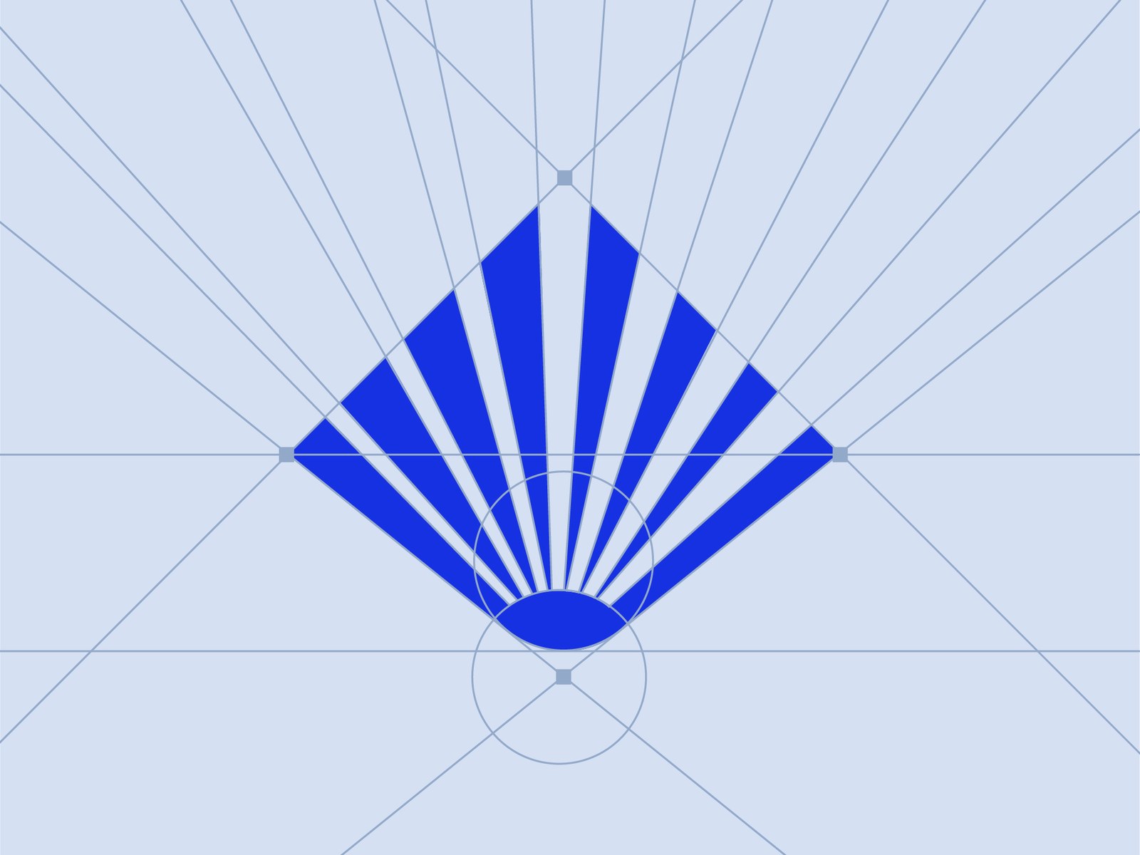
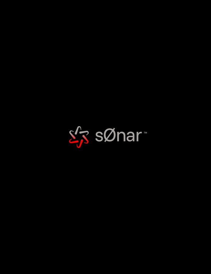
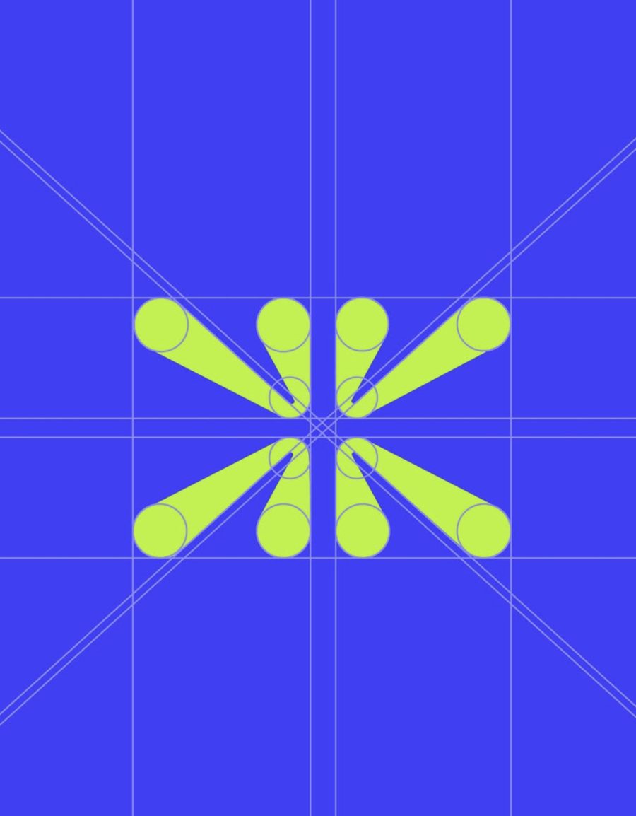
An AI automation brand needed to feel alive, not robotic. So the mark became a woven, smiling icon that works as a wordmark lockup or a standalone symbol.
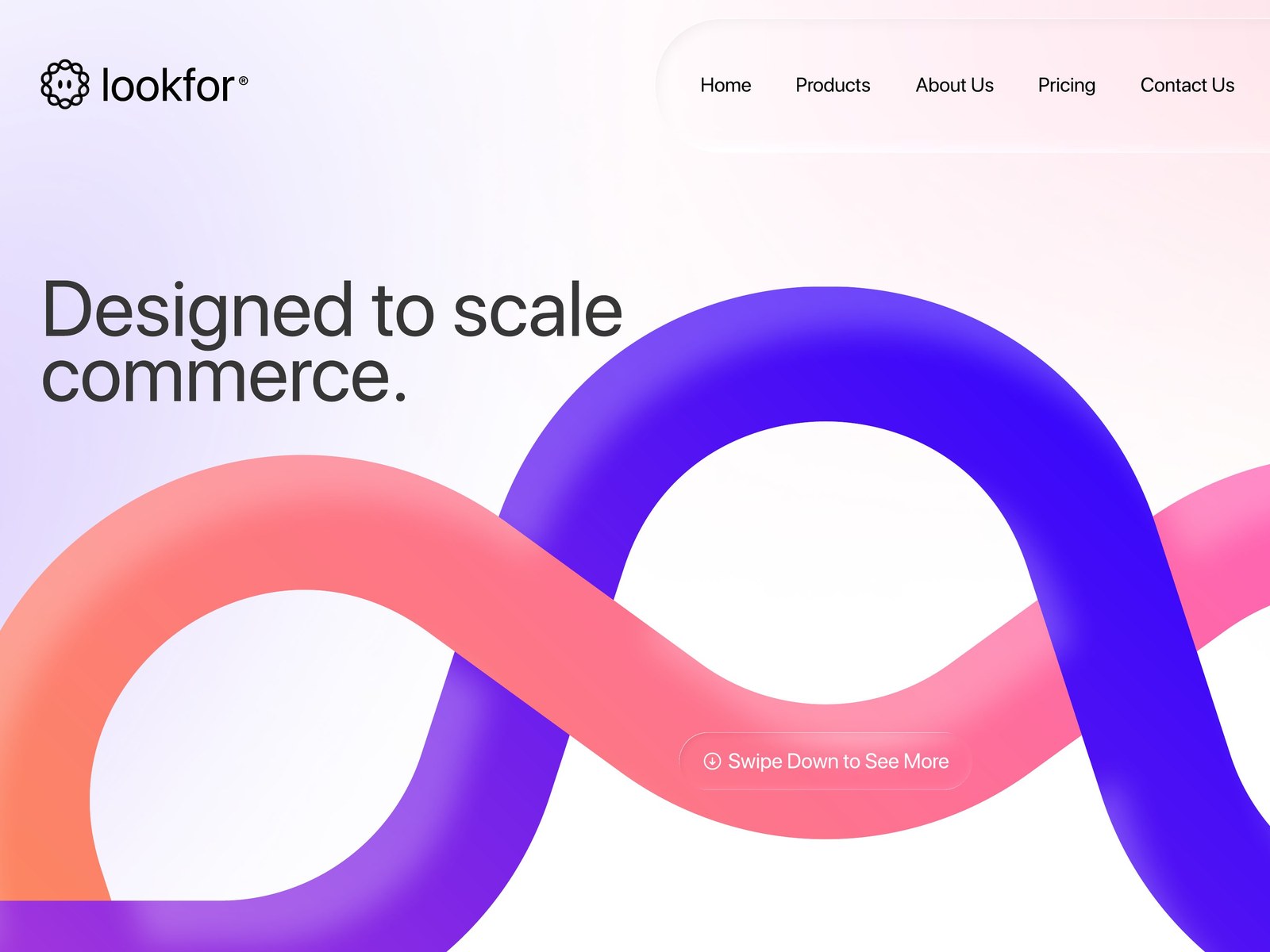
Where the brand lives every day.
The gradient ribbon from the mark becomes the entire visual system: carried straight into the site, the product and every screen the brand shows up on.
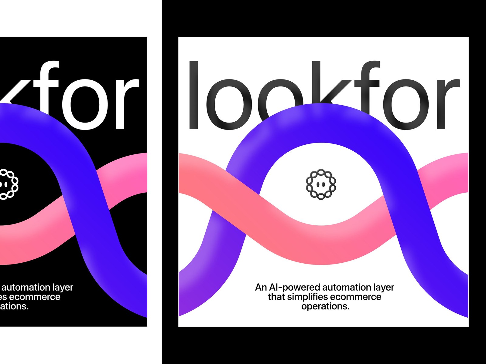
Built to post, not just to exist.
A brand only feels big if it shows up everywhere consistently. So we built ready-to-post templates in both light and dark, not just a logo file and a wish.
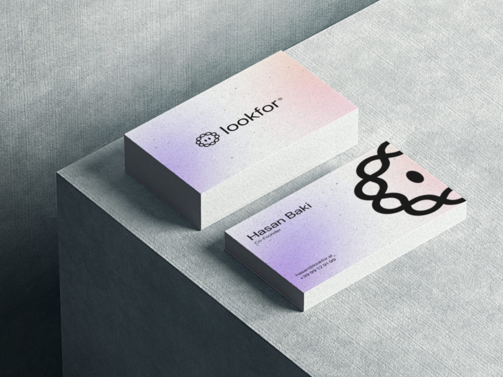
It has to hold up in the hand.
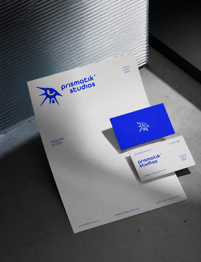
Business cards carry the same gradient system and the founder's name: proof the identity survives contact with the real world, not just a screen.
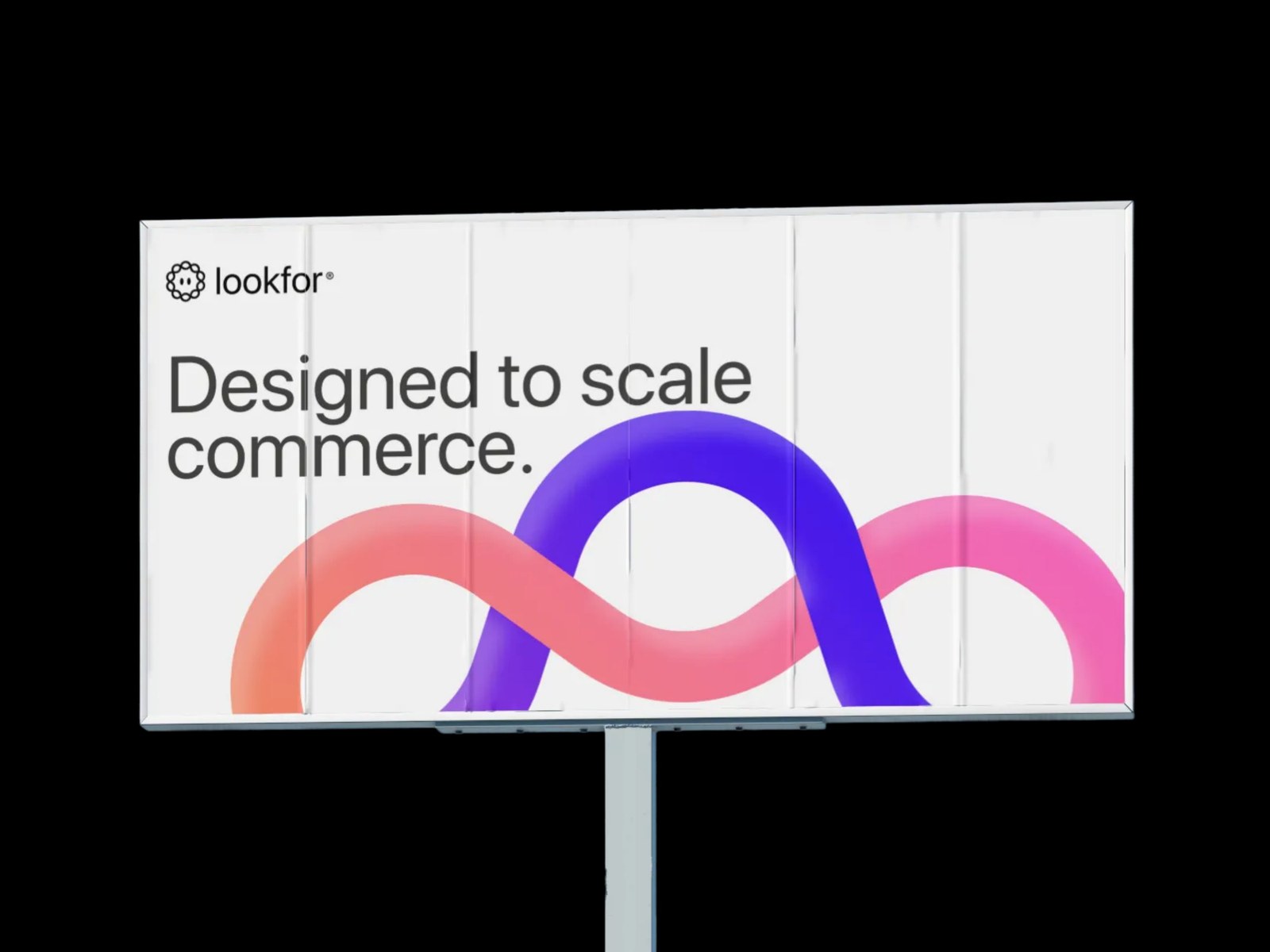
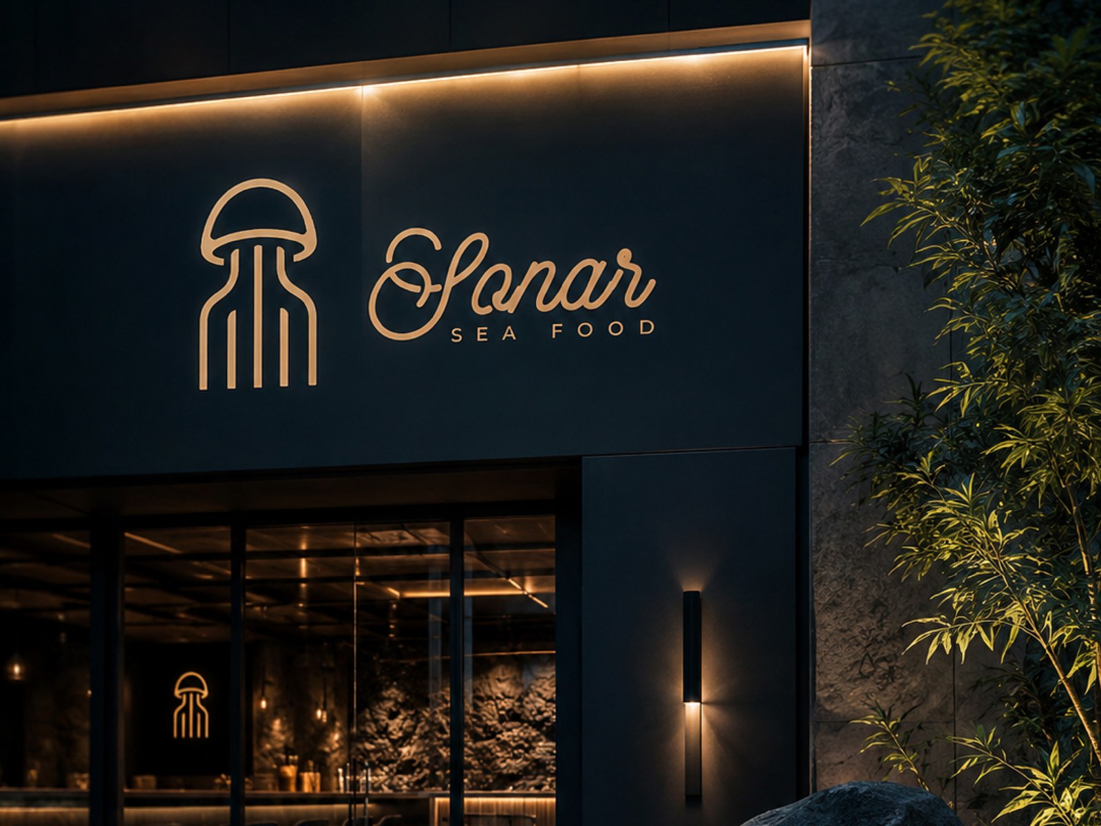
Off the screen, onto the street.
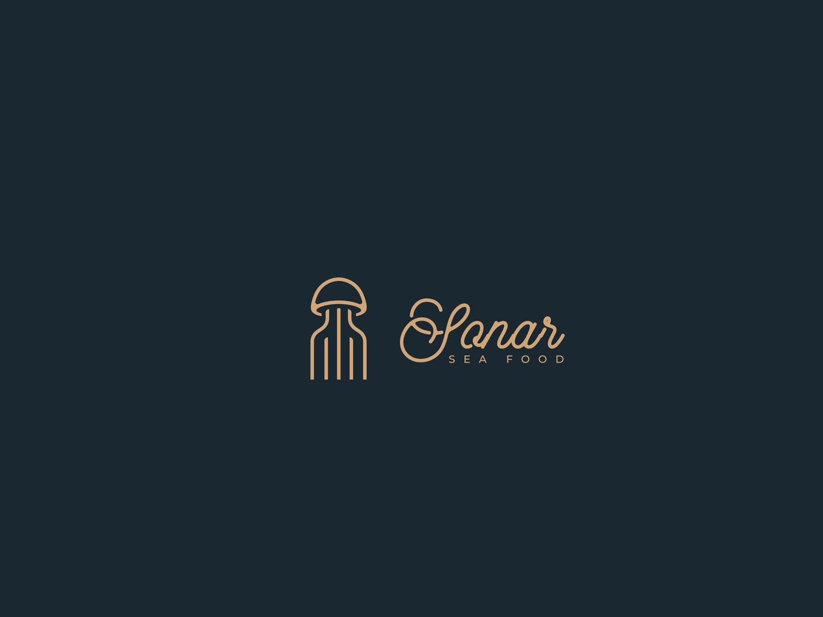
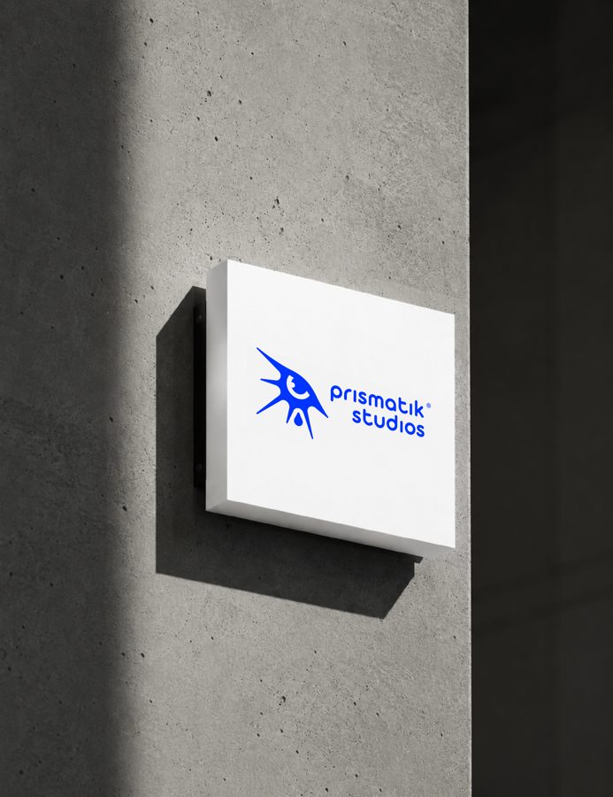
We test the mark at full scale, in the actual space it has to live in, because a logo that only works small isn't a finished identity yet.
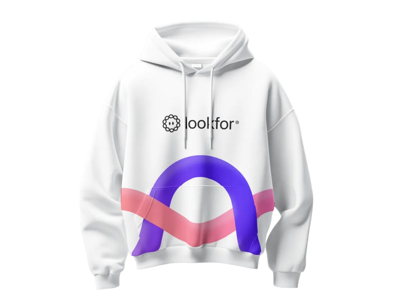
Every touchpoint, one system.
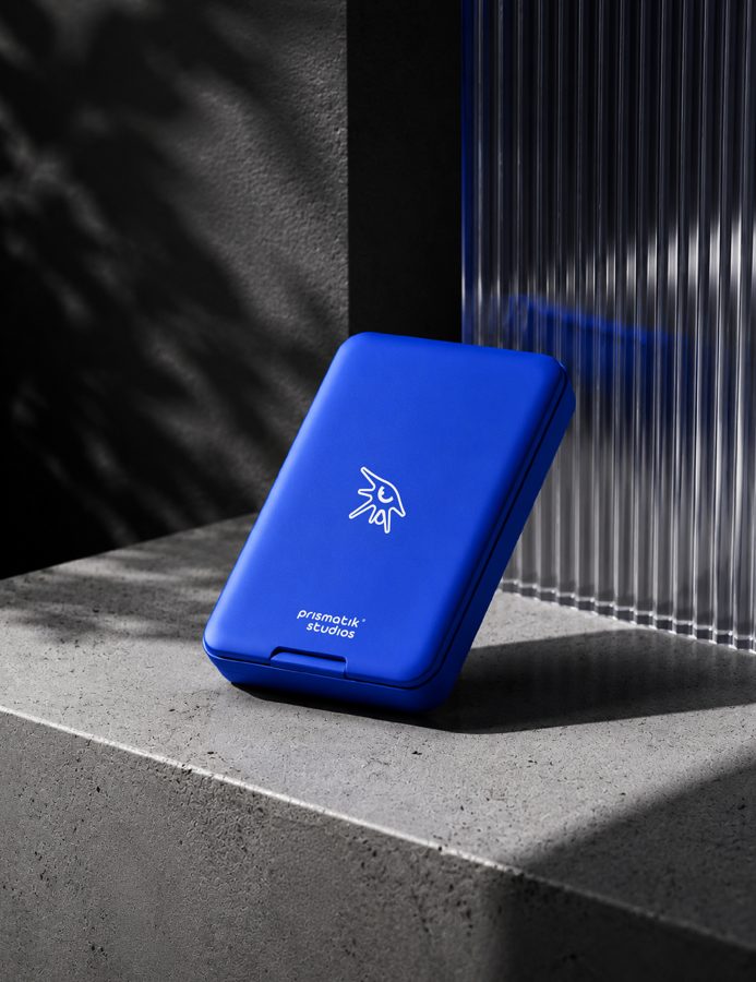
Hoodies, tees, caps: the same mark, the same rules, applied everywhere the brand shows up. This is the full delivery, not a logo file and a goodbye.
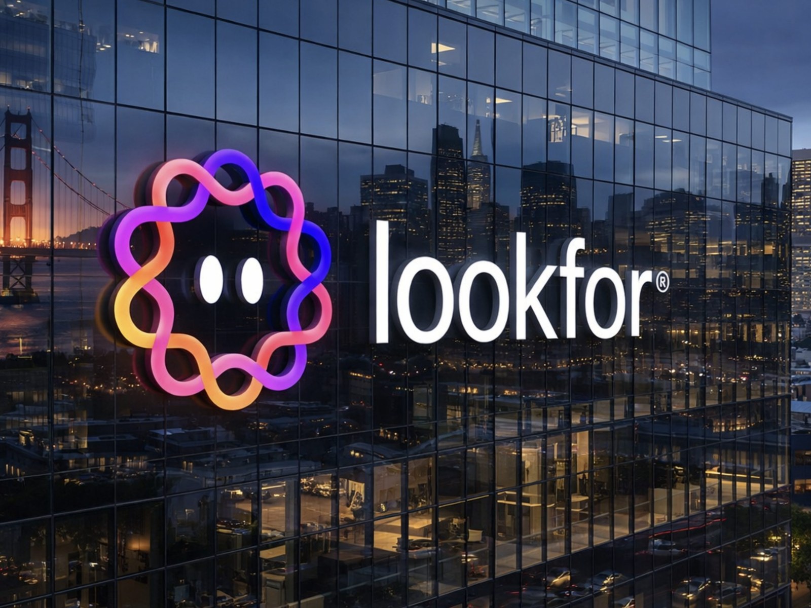
This is what "biggest player" looks like.
From a sketch to a name lit up over a skyline. That's the whole point: a brand built with a system this solid is built to get this big.